Viewports Features
Responsive Controls
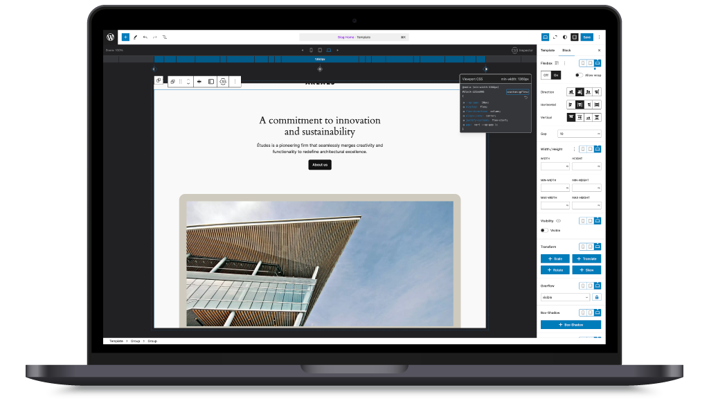
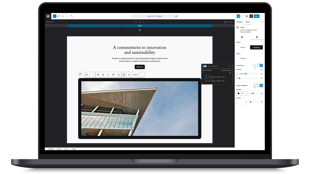
One of the central functions of viewports is the ability to control the BlockStyles of the BlockEditor for different screen sizes.
You do not have to include additional CSS files or media queries for basics such as margin or padding, but can make such changes for mobile, tablet and desktop views in the Gutenberg interface.
Get an overview with keyframe UI
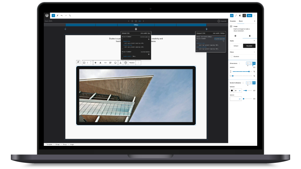
Each viewport is marked by a KeyFrame, similar to video or audio editing programmes.
As soon as the selected block has BlockStyles, a keyframe is generated for the corresponding viewports, which you can click on to view, delete or restore the rendered CSS via the StyleList UI.
Expand your BlockTHeme
One of the most exciting functions is the registerRenderer action of the included DataStore.
You can use it to register your own style components by attaching your function that is responsible for rendering the CSS of your style attribute.
Viewports then monitors the changes in the attributes for each viewport.